
Data point coordinates are determined of course by their X and Y coordinates as if they were on a regular rectangular chart. X values are drawn starting from the 0 degrees and continuing clockwise. Y values are the computed distance of the point from the center of the graph.
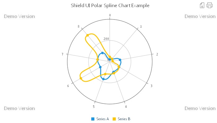
There are two factors that we actually take into account when calculating that distance. These are the graph radius and the highest value of all the represented data series The polar set of charts also include the SpLine, Area, AreaSpLine, Polar Bar and Polar scatter types. Similar to the Polar Line chart is the Polar Spline chart. Here, similar to the classical spline chart, the lines, connecting the data point values are mathematically smoothed as shown on the next image:
We may say that the Shield UI’s polar charts enable easy data series comparison especially if using one of the polar area charts- the polar area or polar spline area. On the next image we have a typical Polar Area Chart:

Thank to the semi transparent fill of the series users have view of the overlapping areas. This applies as well for the polar spline area chart a view of which we have on the next image:

As with other relevant Shield UI’s charts the polar ones can utilize the axis marker. Logically it will differ from the one that we can have on a spline area chart. We have 3 available modes for the axis marker: X, Y and XY. On the next image we have enabled the axis marker settings its mode to X :

We can see the red line beginning from the center of the graph and showing the X value of the current series. We set the axis marker properties just the usual way:
    tooltipSettings: {
      axisMarkers: {
        enabled: true,
        mode: 'x',
        width: 3,
        zIndex: 3,
        color: 'red'
      }
    },
Of course we can the mode to Y instead and we will get the following result:

The marker is in the shape of a circle and is connecting the points with equal values from one of more data series. And if we show the marker in the XY mode we logically will have the following result:

Depending on our needs and data complexity we may also choose from two more polar chart types: polar bar and polar scatter. The polar bar chart uses bars for data visualization and we can see a typical view of it on the next image:

Graphically the polar resemble slightly the slices of a pie chart since their bottom ends which all meet at the center of the chart are skewed for a clear view. The mentioned until now polar chart types use all one dimensional data. This means, that there is one value for each point:
    dataSeries: [{
      seriesType: "polarline",
      collectionAlias: "Series A",
      data: [20.9, 31.5, 98.4, 101.2, 104.0, 175, 103, 115, 107]
    },{
      seriesType: "polarline",
      collectionAlias: "Series B",
      data: [45.5,33.6,28,99,116,125,314,117,325]
    }
There is only one chart from that set of charts that require two-dimensional data and this is the polar scatter chart. We have a view of it on the next image:

And to provide data for the data series we might use code similar to the next one:
    dataSeries: [{
      seriesType: "polarscatter",
      collectionAlias: "Series A",
      data: [[16.4, 5.4], [21.7, 2], [25.4, 3], [19, 2], [10.9, 1], [13.6, 3.2], [10.9, 7.4], [10.9, 0], [10.9, 8.2], [16.4, 0], [16.4, 1.8], [13.6, 0.3], [13.6, 0], [29.9, 0]]
    },{
      seriesType: "polarscatter",
      collectionAlias: "Series B",
      data: [[27.1, 2.3], [16.4, 0], [13.6, 3.7], [10.9, 5.2], [16.4, 6.5], [10.9, 0], [24.5, 7.1], [10.9, 0], [8.1, 4.7], [19, 0], [21.7, 1.8], [27.1, 0], [24.5, 0], [27.1, 0], [29.9, 1.5], [27.1, 0.8], [22.1, 2]]
    }
  ]
Usage of polar charts depends mainly on user needs and data complexity. For instance we may use the Shield UI’s Polar Scatter chart in order to visualize density of occurrences of an event. Or we may easily reflect risk management diagrams using the polar area chart.
Regardless of which type we will pick up we’ll enjoy the typical for all the Shield UI’s HTML5 JavaScript charts ease of data binding to local or remote sources. We can also easily customize elements on the chart like the legend, background and axis markers.
Thanks to the built in legend interactivity we can easily show/hide data series in order to achieve in dept data analysis.
You can find more detail and editable extended example for the complete polar sets of charts here: Live Example
Additional resources such as code samples, documentation and demos can be found here: Documentation and examples
Няма коментари:
Публикуване на коментар