петък, 27 декември 2013 г.

JavaScript Step Area Chart

The Step Area chart provided by Shield UI’s as part of their HTML5 JavaScript library may be referred to as a functional and visual variation of the Step Line chart. We can see a typical look of the chart on the next image:


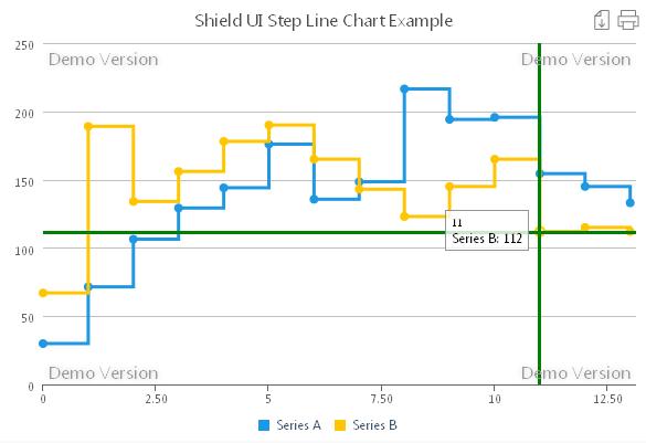
 As we can see, the area between the data points connector line and the X axis is filled- typically for an area chart type. And of course we retain the Step Line drawing mode. As with any other Shield UI’s chart we are not limited to the number of data series displayed on the Step Area chart as well.

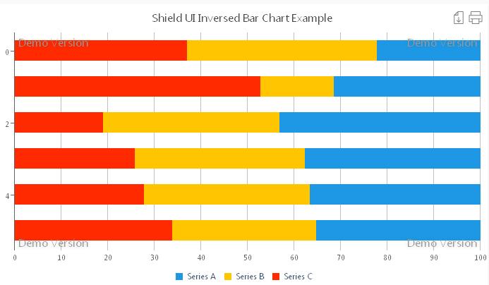
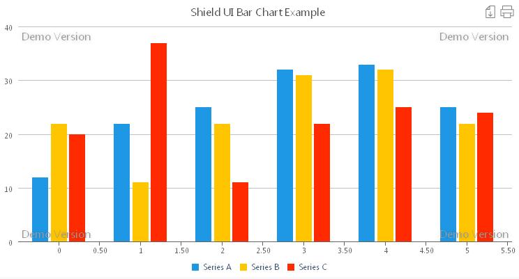
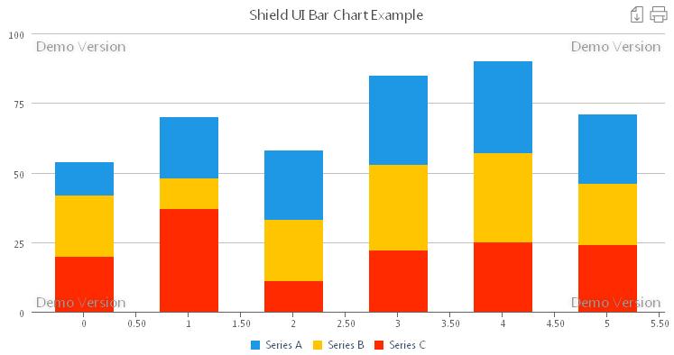
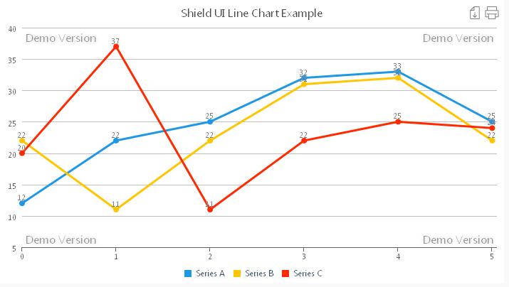
On the next image we can see multiple series visualization:


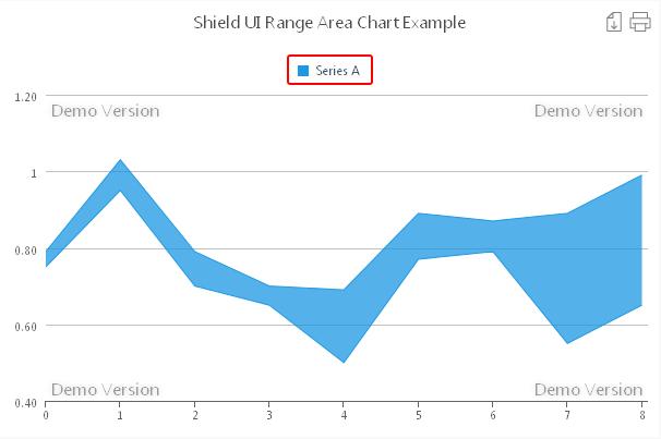
The semi transparent fill of series B allows the lower values of series A to be visible so that users don’t have to care about ordering the series. Furthermore- the series remain visible also when the users zoom in for more detail as shown on the next image:


 In addition to these functionalities we also may display the axis marker both with or without zoom using code like the following one:
    tooltipSettings: {
      axisMarkers: {
        enabled: true,
        mode: 'xy',
        width: 3,
        zIndex: 3,
        color: 'red'
      }
    },
 
And the visual result will be like the one on the next image:


This Shield UI’s Step Area chart also supports local and remote data binding, exporting the chart’s image to a file and printing. As we have already seen multiple data series can be easily added and viewed by the users.

You can look and try the online live example for the Shield UI Step Area Chart here: Live Example

In addition you may look at the online documentation, tutorials and code samples for the Step Area Chart here: Documentation and examples

четвъртък, 26 декември 2013 г.

JavaScript Step Line Chart

The Shield UI’s Step Line HTML5 JavaScript chart uses a different and not so often used technique for data values representation. Similarly to the classical line chart we have one point per value. What this chart differ to it however is that the line connecting the points is not smoothed like the spline charts or not even straight but forms bar like steps. There is a typical view of the chart shown on the next image:


As we can see, the line retains it’s Y value until it reaches the next point and then goes up or down to it. One of the typical usages of the Step Line chart might be to show static or dynamic forex data sets.
We may wish to aid users in easier reading the chart’s data by taking use of the axisMarkers property which dynamically places horizontal or vertical lines to the position of the current data point. To do so we may use similar to the following code:

    tooltipSettings: {
      axisMarkers: {
        enabled: true,
        mode: 'x',
        width: 1,
        zIndex: 3
      }
    }, 
 
On the next image we can see the axisMarker line:


We may also alternatively emphasize the marker line by increasing its width or coloring it:
    tooltipSettings: {
      axisMarkers: {
        enabled: true,
        mode: 'x',
        width: 3,
        zIndex: 3,
        color: green
      }
    },   

And here is the result:


Unlike other Shield UI’s chart types the step line chart takes single values to display. We can conveniently connect the chart to a local or remote data source. In our online demo we are implementing local data binding. The data values are being assigned to two variables as shown below:

  var LocalData = [29.9, 71.5, 106.4, 129.2, 144.0, 176.0, 135.6, 148.5, 216.4, 194.1, 195.6, 154.4, 145, 133];   
  var LocalDataB = [67, 189, 134, 156, 178, 190, 165, 143, 123, 145, 165, 112, 115, 112]; 
 
Than we only need to bind the appropriate variables to their data series as shown:

    dataSeries: [{
      seriesType: "stepline",
      collectionAlias: "Series A",
      data: LocalData
    },{
      seriesType: "stepline",
      collectionAlias: "Series B",
      data: LocalDataB
    }
]
 
As we can see adding multiple series is just as easy as with any Shield UI’s chart. However we need to avoid adding too much data to the chart, since this will only make it look messy and confuse users.

You can look and try the online live example for the Shield UI Step Line Chart here: Live Example

In addition you may look at the online documentation, tutorials and code samples for the Step Line Chart here: Documentation and examples

вторник, 24 декември 2013 г.

JavaScript Range Spline Area Chart

Like some of the other Shield UI’s HTML5 JavaScript charts the range area chart also has its enhanced variation. This is the range Spline area chart. The difference that we can see right away is that similarly to the spline or the spline area charts, the lines, bouldering the areas are mathematically smoothed. On the next image we can see a typical look of the spline area chart:


Aiding the user to interactively read the charts data we may take use of the axisMarkers property which dynamically places horizontal or vertical lines to the position of the current data point. To do so we may use similar to the following code:
    tooltipSettings: {
      axisMarkers: {
        enabled: true,
        mode: 'x',
        width: 1,
        zIndex: 3
      }
    },   
On the next image we can see the axisMarker line:


We may also format the line just the way we like or need. For instance we may make it thicker and even paint it in red to even more distinguish it from the chart:
    tooltipSettings: {
      axisMarkers: {
        enabled: true,
        mode: 'x',
        width: 3,
        zIndex: 3,
        color: 'red'
      }
    },   
And here is the result:


In case we also need a horizontal line, showing us the Y values we just need to set the mode property to:

 mode: 'xy',
 
And on the next image we can see the result of using the ‘xy’ axismarker mode:


A typical use utilizing the range spline area chart would be to display multiple series. So we can see whether there are overlapping ranges, for which values of X they occur and so on. On the next image we can see a typical multiple series view of the the Shield UI range spline area chart:


Just at a glance we can see, thet there are two overlapping areas occurring for 4 and 8. In case we need to, we can also easily zoom in for closer detailed view using the desired zoom mode:
zoomMode:'xy',
 
As in our online live example we can easily bind to local data. The code below illustrates how to declare and populate a variable containing our data:

var LocalData = [
[0.75, 0.79],
…
  ]; 
];
 
In a similar manner we declare a secondary variable and then bind the chart’s series to them:

    dataSeries: [{
      seriesType: "rangesplinearea",
      collectionAlias: "Series A",
      data: LocalData
    },{
      seriesType: "rangesplinearea",
      collectionAlias: "Series B",
      data: LocalDataB
    }
  ]
 
 
You can look and try the online live example for the Shield UI Range Spline Area Chart here: Live Example

As usual there is plenty more information and code example for the Range Spline Area chart available online here: Documentation and examples

събота, 21 декември 2013 г.

JavaScript Range Area Chart

Shield UI’s library of HTML5 JavaScript charts offers another useful chart not quite popular amongst users. This is the range area chart. As it name tells, it is similar to the classical area charts since data points are connected with a straight line. However there is one thing that makes it different. This is the range that is being visualized instead of the single values being drawn on a area chart. On the next image there is a sample area chart view:


We may add labels showing each points values by enabling the dataPointText property as shown in the code sample below:

        dataPointText: {
         enabled: true,
         borderRadius: 4,
         borderWidth: 2,
         borderColor: "red"
        }
 
Having done so, we get the following result:


There are two labels per point showing the low and high range values. For more complex data series, or just as when needed we may enable zoom for the Shield UI Range Area chart. For that purpose we use the following code:

zoomMode:'xy',
 
The chart can be easily bound to remote or local data. As shown in the online example we take use of local data binding, by declaring an array and filling it up with the values we are going to visualize:

var LocalData = [
[0.75, 0.79],
…
  ]; 
];
 

We may use one or more variables- depending on the number of data series we are going to use. When done, we simply pass the array data to the chart’s data property:
 
 seriesType: "rangearea",
      collectionAlias: "Series A",
      data: LocalData
 
In addition we may apply some styles to the legend by centering it on the top and putting a red rounded corners box around it. We make that using the following piece of code:

    chartLegend: {
      align: "center",
      borderRadius: 2,
      borderWidth: 2,
      verticalAlign: "top",
      borderColor: "red"
    },

On the image below we can see the result of styling the legend:


The range area chart also supports export to an image file or printing of the chart by a single click on the export or print buttons.

A live example for the Shield UI Range Area Chart that you can try yourself can be found here: Live Example

More information as well as extensive code samples for the Range Area chart type can be found here: Documentation and examples

четвъртък, 19 декември 2013 г.

JavaScript Inversed Range Bar Chart

The inversed range bar chart, part of the Shield UI HTML5 JavaScript charting library, may be referred to as a variation of the range bar chart. It offers different vision of data representation- bars ranges are shown on the X instead of the Y axes. We can see a sample image below


Similar to Shield UI Range Bar Chart we can add data point labels in order to assist users in faster reading the graph values. In addition we may further graphically distinguish the labels by placing a border around them. In order to do so, we use the dataPointText property as shown in the sample code below:

        dataPointText: {
         enabled: true,
         borderRadius: 4,
         borderWidth: 2,
         borderColor: "red"
        }
 
And on the next image we can see the result:


As for the Shield UI Range Bar chart, zooming is also allowed for the inversed bar chart. We only need to set the desired mode by using the code below:

zoomMode:'xy',
 
We need to take into consideration, that the chart has the axis X and Y switched. This means, that if we need to zoom on the X axis, we actually set zoomMode:'y' instead of zoomMode:'x'. On the next image we can see the chart zoomed in:


As visible from the above illustration it is more logical to use the ‘y’ zoom mode, instead of ‘x’ or ‘xy’. This will allow us to show smaller ranges in closer details by stretching them only alongside, instead of zooming in as shown on the next image:


Just as any Shield UI chart, the inversed bar chart can easily be bound to local or remote data. For that purpose we declare a variable and populate it with the needed data values as shown:
 
var LocalData = [
[0.75, 0.79],
[0.95, 1.03],
[0.70, 0.79], 
…
  ]; 
];
 
Here again values come in pairs- so that ranges begins and ends are clearly declared.As we can see data values come in pairs- so that ranges can be formed for each of the bars on the graph. Than we only need to bind it to the data series:

      seriesType: "rangebar",
      collectionAlias: "Series A",
      data: LocalData
 
An editable live example for the Shield UI Range Bar Chart is available here: Live Example

More information as well as extensive code samples for the Range Bar chart type can be found here: Documentation and examples

събота, 14 декември 2013 г.

JavaScript Range Bar Chart

The range bar offered by Shield UI as part of their HTML5 JavaScript charting library offers users the ability to visualize ranges of data over time. For instance using the Range Bar Chart we may show daily temperature low-high ranges. On the image below we can see a typical look of this chart type:


One of the differences we can see between the Shield UI Bar Chart and Range Bar Chart is that the bars here are not lined up at their bottom ends. This reflects the main concept this chart visualizes data. Bars are lined up at their pairs of values on the Y axis. This means, that if one bar represents the values 2 and 3 for instance, it will be placed according to the Y axis starting from the value 2 and stretching up in height until the value 3. Although this concept is quite clear, users can be assisted in reading the chart’s graph by using data point labels. We can enable them just the usual way using code like the sample below:
        dataPointText: {
         enabled: true,
         borderRadius: 4,
         borderWidth: 2,
         borderColor: "red"
        }
The visual result from the code can be seen on the next image:


 As we can see, labels are placed immediately below and above each of the bars, making quite easy for the user to track values. And for even more user comfort we have placed a rounded corners border around each label. Similar to the bar chart, we may reverse the bars orientations by switching the X and Y axis positioning. We may do so by using the isInverted property as shown below:
isInverted: true,  
Below is an image showing the result:


 Zooming is allowed for the Shield UI Range Bar chart, and it can be enabled by setting the desired zoom mode:
zoomMode:'xy',
As shown in the online code sample, we can easily bind the chart to local data. For that purpose we declare a variable and populate it with the needed data values as shown:
  var LocalData = [
[0.75, 0.79],
[0.95, 1.03],
[0.70, 0.79], 
[0.65, 0.70], 
[0.5, 0.69], 
[0.77, 0.89],
[0.79, 0.87],
[0.55, 0.89],
[0.65, 0.99]
 ]; 
];
As we can see data values come in pairs- so that ranges can be formed for each of the bars on the graph. Than we only need to bind it to the data series:

      seriesType: "rangebar",
      collectionAlias: "Series A",
      data: LocalData
 
Of course the chart can be bound to remote data as well. It also allows users to export the current state of the chart to a graphical file, or send it to the printer.

An editable live example for the Shield UI Range Bar Chart is available here: Live Example

More information as well as extensive code samples for the Range Bar chart type can be found here: Documentation and examples

петък, 13 декември 2013 г.

JavaScript Donut Chart

Shield UI Charts variety: Donut Chart Shield UI HTML5 JavaScript charting library offers to users another useful chart type- the Donut chart. It is similar to the Pie chart on some respects- it uses circular graph to show percentile contributions of values to a whole. It is as convenient as the pie chart, since users don’t have to pre calculate data supplied. These calculations are done automatically and users only need to provide the data being visualized. On the next image is a typical view of the Shield UI Donut Chart:


 As we can see, slices in the Donut chart type look like bent rectangles and we have an empty center on the data plot. Just like in the Pie Chart we have an interactive legend, that allows users to hide/show slices by clicking on the corresponding legend item. On the next image we have some visible and some hidden slices:


Besides its interactivity, the chart legend has adjustable appearance and positioning to fit any user visual preferences. The Shield UI Donut Chart users can freely place the legend around the plot area and apply the formatting they want. For instance we may place the legend on the top of the data area and round its corners by using the following simple code:

    chartLegend: {
      align: "center",
      borderRadius: 2,
      borderWidth: 2,
      verticalAlign: "top"
    }, 
 
And on the image below is the visual result of this code:


Similar to the Pie chart, the Donut chart’s interactivity allows selected slices to move away from the center. This behavior is being set by the enablePointSelection and the slicedOffset properties. The enablePointSelection property allows users to select each of the Donut’s slices. And the slicedOffset property determines how far away the selected slice will move from the center. The code sample below shows a way of setting the two properties:

        enablePointSelection: true,
        slicedOffset: 50,
 
And on the image below we can see the result:


 User’s don’t have the ability to zoom in on the Shield UI Donut chart, neither might there be a need to, since all data is visible on the chart. As shown in the online code sample, we can easily bind the chart to local data. For that purpose we declare a variable and populate it with the needed data values as shown:

  var LocalData = [
    ["Category A", 14.2],
    ["Category B", 36.6],
    ["Category C", 40],
    ["Category D", 13.1],
    ["Category E", 52.4]
  ];
 
Than we only need to bind it to the data series:
    dataSeries: [{
      seriesType: "donut",
      data: LocalData
    }]
 
Of course the chart can be bound to remote data as well. It also allows users to export the current state of the chart to a graphical file, or send it to the printer.

An editable live example for the Shield UI Donut Chart is available here: Live Example 

More information as well as extensive code samples for the Donut chart type can be found here: Documentation and examples

четвъртък, 12 декември 2013 г.

JavaScript Pie Chart

The Pie chart is a very popular chart used for visualization of data values by graphically representing their contribution to the whole. As part of Shield UI HTML5 JavaScript charting library this classical chart type offers users convenience, reliability and ease of use. The following image shows a common layout of the pie chart:

One of the convenience features is the legend interactivity. If added to it, the pie’s slices may be shown or hidden simply by clicking on the corresponding legend item- and this without any code from the user. For even more flexibility, the addToLegend property can be set to false, in order to add no items to the legend:
addToLegend: true,
As shown on the next image some of the pie’s slices have been hidden:


As to any of the Shield UI Charts users can easily apply additional formatting and styling to the Pie Chart type. We may place the legend on the top of the data area and round its corners by using the following simple code:

    chartLegend: {
      align: "center",
      borderRadius: 2,
      borderWidth: 2,
      verticalAlign: "top"
    }, 
 
And on the image below is the visual result of this code:


 An addition to the chart’s interactivity is the possibility for the selected pie’s slice to move away from the center. This behavior is being set by the enablePointSelection and the slicedOffset properties. The enablePointSelection property allows users to select each of the pie’s slices. And the slicedOffset property determines how far away the selected slice will move from the center. The code sample below shows a way of setting the two properties:

        enablePointSelection: true,
        slicedOffset: 50,
 
On the image below we can see the result:


One of the ways the pie charts differs from the other Shield UI charts, is that there is no possibility to zoom in. And among its typical features are the local and remote data binding, exporting and printing options. It is important to mention, that exporting allows the most recent state of the chart to be saved as a graphical file. This adds a lot of dynamics, since we can export not a static chart, but for instance a preselected slice.We may also hide some of the less important slices and that state of the chart that suits us best.

An editable live example for the Shield UI Pie Chart is available here: Live Example

More information and code samples for the Pie chart type can be found here: Documentation and examples

сряда, 11 декември 2013 г.

JavaScript Bubble Chart

An interesting chart of the Shield UI HTML5 JavaScript charting library is the Bubble Chart. It is similar in some ways to the Scatter Chart, but as it name shows- the data series points may have variable sizes. There is an image below, showing a typical view of the Bubble Chart type:


Similar to the Scatter chart we need to provide X and Y values for each point, but in addition we must also specify its size. Following piece of code shows a possible way to supply data series values:
data: [
  {
    x: 31.45,
    y: 26.4,
    size: 22
  },
]
Similar to the Scatter chart we may take use of axisMarkers and dataPointText properties, however they may not be quite suitable for that type of chart. We may custom format the tooltips available for each of the data series points. The following piece of code shows a way to do so:
    tooltipSettings: {
      customHeaderText: 'Current Point:',
      customPointText: function (point, chart) {
        return shield.format(
          'Formatted text: {point.x} Formatted Text:{point.y}',
          {
            point: point,
            color: point.y > 87 ? 'red' : 'green'
          }
        );
      }
    },
Using conditional formatting, we display the tooltips in two colors: red or green, depending on the current point Y value. On the image below we can see the result:


We can base our formatting also on the point.x, point.y and point.size values. For instance we may prompt user that a point of the chart has a size exceeding certain limit. Zooming for the Shield UI Bubble Chart can be enabled the usual way:

zoomMode: "xy",
 
Data binding to local or remote data is as easy as all of the chart of the Shield UI Charting library. The following code shows declaring a variable and populating its array with values:

  var LocalData  = [
    { x: 91, y: 144.9, size: 1},
    { x: 33, y: 14.9, size: 71},
    { x: 81, y: 42.9, size: 41},
    { x: 41, y: 34.9, size: 13},
    { x: 67, y: 78.2, size: 113}
];

An editable live example for the Shield UI Bubble Chart can be found here: Live Example
More information and code samples for the Bubble chart type can be found here: Documentation and examples

JavaScript Scatter Chart

The Shield UI Scatter Chart is the next of the extensive HTML5 JavaScript library of charts. There are two convenient ways for users to supply data for visualization. The first one is to supply both X and Y values for each point, which is the primary advantage of the Scatter Chart. In this case the code will look similar to the following one:
data: [[6.4, 13.4], [1.7, 11], [5.4, 8], [9, 17], [1.9, 4], [3.6, 12.2], [1.9, 14.4], [1.9, 9], [1.9, 13.2]]
Of course at user’s discretion one dimensional lists of can be used too, in which case points will be placed in consecutive order on the X axis as shown in the following code sample:
data: [2,5,16,22,34]
On the next image is a sample view of the The Shield UI Scatter Chart:


If we need, using the dataPointText property we may display the Y values of each scatter point as shown in the code below:

seriesSettings: {
scatter:{
      dataPointText: {
        enabled: true
  }
 }
}, 
 
Having done so, the chart will look similar to the image below:

For more enhanced interactivity, we may also take use of the axisMarkers – vertical and/or horizontal lines, displayed on the chart when user selects a point. On the next image we have a view of the scatter chart with one point selected and the axisMarkers being visible:


The axisMarkers is also quite convenient when user zooms in on data of the chart. Since by default zooming is turned off, we need to enable it by only setting the desired zoom mode- vertical, horizontal or both. The following code shows us how to enable both vertical and horizontal zoom:
 
zoomMode: "xy",
 
Depending on our needs, we may add additional axes to our Scatter Chart so that reading data from it is even easier for the users. As easy as usual, this Shield UI Scatter Chart can be easily bound to local or remote data. The next piece of code illustrates how to declare a variable containing the data necessary for one of our data series:

  var LocalData  = [
    { x: 1, y: 4.9 },
    { x: 33, y: 14.9 },
    { x: 11, y: 42.9 },
    { x: 41, y: 34.9 },
    { x:17, y: 78.2 }
]; 
 
A live editable example with remarks for the Shield UIScatter Chart can be found here: Live Example

More information and code samples for the Scatter chart type can be found here: Documentation and examples

понеделник, 9 декември 2013 г.

JavaScript Spline Area Chart

The Spline Area is another chart of the rich Shield UI HTML5 JavaScript charting library. Data values on this type of chart are visualized by means of colored areas with smoothed boundaries. A typical view of the chart is shown on the image below:


The Shield UI Spline Area Chart allows user to display one or more data series, containing both positive and negative values. For enhanced user experience we may display each of the data point values by enabling the dataPointText property as shown below:
seriesSettings: {
 spline: {                       
         dataPointText: {
                 enabled: true
  }
 }
},

The result of enabling the dataPointText property can be seen on the next image:


Similar to the Bar Chart type, the Spline Area Chart can also be reversed and the values displayed along the X instead of the Y axis. To do so we need to enable the isInverted property:
 
isInverted: true,
 
Having reversed the chart we will have a result similar to the image below:


Since our sample chart contains negative values, when in reversed mode, they will be displayed left from the 0 instead of below it when in normal mode. Users can add one or more additional Y axis with independent labels and styling so that data representation is even more enhanced and comprehensive.
 The code provided below shows us how to add additional Y axes:
    axisY: [{
      min: -100,
      max: 100,
      title: {
        text: "Additional Y Axis",
        style: {
          color: "#4DB0F5"
        }
      },
      axisTickText: {
        style: {
          color: "#4DB0F5"
        }
      }
    }, {
      min: 0,
      max: 100,
      title: {
        text: "Additional Y Axis 2",
        style: {
          color: "#FFC500"
        }
      },
      swapLocation: true,
      axisTickText: {
        style: {
          color: "#FFC500"
        }
      }
    }, {
      min: -25,
      max: 25,
      title: {
        text: "Additional Y Axis 3",
        style: {
          color: "#FF1800"
        }
      },
      swapLocation: true,
      axisTickText: {
        style: {
          color: "#FF1800"
        }
      }
    }],

The visual result is shown on the image below:


We can see, that the different Y axes have different ticks. This is because we have set explicit min and max values. We may use this approach in order to fine tune each of the Y axes.

Besides these more specific features, the Spline Area Chart offers the typical for the Shield UI charting library functionalities. Amongst these as usual are zooming, panning, binding to local and remote data, export and printing.

A live editable example with remarks for the Shield UI Spline Area Chart can be found here: Live Example

Additional resources and code samples for the Inversed Bar Chart can be found here: Documentation and examples

четвъртък, 5 декември 2013 г.

JavaScript Spline Chart

The Spline Chart offered by Shield UI as part of their HTML5 Charting Library may be referred to as an enhanced version of the classical line chart. In this chart the lines connecting the data series points are smoothly curved as shown on the next image:
 SpLine_1 

Besides the enhanced look this chart offers all the feature and functionalities of the library. Being often convenient for Spline charts containing more than one data series, we may display the values of each point by enabling the dataPointText property. The following code shows how we can do that:
seriesSettings: {
 spline: {                       
         dataPointText: {
                 enabled: true
  }
 }
},
If we add all data series to the legend, we than may show or hide certain ones, so that we can easily make comparisons or analyses.

 SpLine_2 

As we can see from the above image only one data series remains visible, so that we can easily focus on its values. Combined with the labels visible for each point users have a great deal of information available in front of them. As much as style is concerned we can not only have a chart legend- a list of the available data series, but we can also format it just the way we need. We can place it top or bottom, left or right, can adjust corners smoothness and so on as shown in the next code fragment:
                chartLegend: {
                    align: "center",
                    verticalAlign: "top",
                    borderRadius: 2,
                    borderWidth: 2
                },
Being part of Shield UI HTML5 Charting Library the Spline chart supports the same easy and reliable way of data binding. We may either directly supply the data series values as shown below:

dataSeries: [{
seriesType: 'Spline',
collectionAlias: "Name of Alias",
data: [1,2,3,4,5]
},
 
Or we may use a variable:

dataSeries: [{
seriesType: 'Spline',
collectionAlias: "Name of Alias",
data: VariableA 
},
Shield UI Spline chart also supports binding to remote data, smooth and reliable zooming and panning, as well as exporting and printing features. For even more convenience the chart legend has built in interactivity- clicking on a data series label automatically hides/shows it without the user having to write a single line of code.

A live editable example for the Inversed Shield UI Bar Chart can be found here: Live Example

Additional resources and code samples for the Inversed Bar Chart can be found here: Documentation and examples

сряда, 4 декември 2013 г.

JavaScript Inversed Bar Chart

We may look at the Inversed Bar Chart as a subset of the Shield UI HTML5 JavaScript Bar Chart. As its name shows, data on this chart is being visualized by means of horizontal instead of vertical bars. The image below illustrates a common look of the Inversed Bar Chart:

InversedBar_1 

There is one property that needs to be set as shown below in order to have our Bar Chart inversed:
isInverted: true,
By default this property is set to false and we have classical vertical bars. Similarly the Shield UI Inversed Bar Chart may contain one or more series of data represented by bars of identical colors. Each of the series is set up in code in a manner to the following code:

dataSeries: [{
seriesType: "bar",
collectionAlias: "Total Visits",
data: [12, 11, 23]
}, {
seriesType: "bar",
collectionAlias: "Unique Visits",
data: [12, 11, 23]
}]
 
There are no additional settings for the Inversed Bar Chart data series. The Inversed Shield UI Bar Chart has the same useful features like the normal Bar Chart. We again may preselect a bar from the data series code as shown below:

data: [12, { y: 11, selected: true }, 23]
 
Each of the data series bars may be selected or we may prevent them from doing so by using the enablePointSelection property:

seriesSettings: {
    bar: {
        enablePointSelection: true      
    }
}
 
The grouping of data series values is also possible for the Inversed Shield UI Bar Chart and so is stacking- showing the cumulative values for each data series point. Here again there are two options users can choose from. We may stack values by adding them, retaining the differences of the bars as shown on the image
below:

  InversedBar_2  

 In order to do so we use the stackMode property as shown:
seriesSettings: {
bar: {
stackMode: "normal"
}
},
 
Percent stacking is also available for the Inversed Bar Chart. The visual effect is quite similar to the normal Bar Chart. In order to use percent stacking we use the following code:

seriesSettings: {
bar: {
stackMode: "normal"
}
},
 
The resulting chart is shown on the next image:
InversedBar_3
The difference between the two stacking modes like when using normal Bar Chart is that when using normal stacking, each bar represents a cumulative value of the sums of all the data series for each point. When using percent stacking the values for each point are represented as percentiles of the cumulative value.
The Inversed Shield UI Bar Chart doesn’t differ in features. It allows easy binding to remote or local data, zooming, exporting or printing.

A live editable example for the Inversed Shield UI Bar Chart can be found here: Live Example
Additional resources and code samples for the Inversed Bar Chart can be found here: Documentation

JavaScript Bar Chart

The Shield UI Bar Chart is another classical HTML5 JavaScript chart type offered to users as part of their extended charting library. It is intended mainly to show or compare data change between categories using equally sized bars. Below you may find an illustration of the chart’s typical look:
BarChart
A Shield UI Bar Chart may contain one or more series of data represented by bars of identical colors. Each of the series is set up in code in a manner to the following code:

dataSeries: [{
seriesType: "bar",
collectionAlias: "Total Visits",
data: [12, 11, 23]
}, {
seriesType: "bar",
collectionAlias: "Unique Visits",
data: [12, 11, 23]
}]
 
Although being a popular type of chart, the Shield UI Bar Chart offers many useful features. For instance we may emphasize a bar of a data series by preselecting it. We may do so right in the code:

data: [12, { y: 11, selected: true }, 23]
 
We may allow the users to select a bar or prevent them from doing so by using the enablePointSelection property:

seriesSettings: {
    bar: {
        enablePointSelection: true      
    }
}
 
For more advanced data sets or more advanced comparisons the Shield UI Bar Chart offers users the ability to group data series by stacking them in one bar and showing the cumulative values on the chart. There are two options users can choose from: The one, shown on the image below:

BarChart2
uses the stackMode property set to normal:
seriesSettings: {
bar: {
stackMode: "normal"
}
},
We can also use percent stacking, in which case all the bars will be of equal height as shown on the next image:
 BarChart3 
To enable percent stacking we use the following code: 

seriesSettings: {
bar: {
stackMode: "percent"
}
},
 
The difference between the two stacking modes is that when using normal stacking, each bar represents a cumulative value of the sums of all the data series for each point. When using percent stacking the values for each point are represented as percentiles of the cumulative value.
 The Shield UI Bar Chart offers users effortless binding to remote or local data along with features like zooming, exporting or printing of the chart. This reliable HTML5 JavaScript Chart supports multiple axes and negative values representation.
We may use an additional Y axis when the data displayed on the chart may have dual meanings. For instance one value for weight may be shown in kilograms and pounds both supplying user with more information and keeping the chart area easy to read.

A live editable example for the Shield UI Bar Chart can be found here: Live Example
Additional resources and code samples can be found here: Documentation

вторник, 3 декември 2013 г.

JavaScript Line Chart

The line chart is a classical and very popular tool for data visualization. The one - part of the Shield UI HTML5 JavaScript Charting library offers great performance and convenience for users. Used mostly for showing different trends and performances over a period of time, the chart represents one or more series of dots connected with a straight line. Variations of this popular chart are charts with mathematically calculated smoothed lines, connecting the points. Below is an image showing a view of Shield UI Line Chart.
Image_1
The chart offers many features – both visual and functional. For instance additional informational labels can be placed along each point for faster and accurate data reading by the users. For this purpose we use the seriesSettings property as shown:
seriesSettings: {
 line: {                       
         dataPointText: {
                 enabled: true
  }
 }
},
Amongst the functional features of the chart are worth noticing are the possibilities of binding it to Local, Remote or Live Data. And this combined with the easy referencing and rendering of the chart using a <DIV></DIV>container . Data supplied data for each series is in the format:
dataSeries: [{
seriesType: 'area',
collectionAlias: "Name of Alias",
data: [1,2,3,4,5]
},
But we may also declare two-dimensional arrays for passing both the data series and categorical values as shown in the code below:
            var VariableA = [                
                {x:'2001',y:0.164},
                {x:'2002',y:0.173},
                {x:'2003',y:0.184},
                {x:'2004',y:0.167},
                {x:'2005',y:0.177},
                {x:'2006',y:0.189},
                {x:'2007',y:0.180},
                {x:'2008',y:0.183},
                {x:'2009',y:0.188},
                {x:'2010',y:0.160},
                {x:'2011',y:0.176},
                {x:'2012',y:0.178}
            ];
            var VariableB = [                
                {x:'2001',y:0.103},
                {x:'2002',y:0.105},
                {x:'2003',y:0.112},
                {x:'2004',y:0.111},
                {x:'2005',y:0.102},
                {x:'2006',y:0.099},
                {x:'2007',y:0.110},
                {x:'2008',y:0.113},
                {x:'2009',y:0.117},
                {x:'2010',y:0.119},
                {x:'2011',y:0.123},
                {x:'2012',y:0.117}
            ]; 
                dataSeries: [{
                    seriesType: 'line',
                    collectionAlias: "Series A",
                    data: VariableA
                }, {
                    seriesType: 'line',
                    collectionAlias: "Series B",
                    data: VariableA
                }]
As seen in the above snippet we have no extra code at all in order to bind to predefined data:. We only assign it to the chart’s series:
data: VariableA
When set to percent the stackMode property will represent data as rectangular area divided by each data series values as shown on the next image: A live editable example for the Shield UI Line Chart can be found here: Live Example

JavaScript Area Chart

One of the charts of the rich HTML5 JavaScript ShieldUI Charting library is the Area type chart. It is used to utilize data visualization of cumulative values over a period of time or range. The chart is similar to a classical JavaScript Line graph. The difference is that data is being visualized with the usage of additional colored areas placed in the space locked between the series data points.

Image_1 

Positive values are represented by a colored area beginning from the X axis and filling up the space between it and the line connecting the points. Similarly for the negative values the colored area is placed below the X axis and bounded in the same manner. The ShieldUI Area JavaScript Chart is being referenced and declared in the usual way, using a <DIV></DIV> container to host the rendered chart. Data supplied data for each series is in the format:
dataSeries: [{
seriesType: 'area',
collectionAlias: "Name of Alias",
data: [1,2,3,4,5]
},
An important feature of the Area chart type is the ability to show values not only as absolute ones but also as a part of a whole. We may do so by using the stackMode property as shown:
seriesSettings: {
area: {
stackMode: "percent"
}
},
When set to percent the stackMode property will represent data as rectangular area divided by each data series values as shown on the next image:
 Image_2 
 The ShieldUI Area Chart offers convenient binding to local or remote data without any additional code. The retrieved data is simply passed to the data series as shown:
dataSeries: [{
seriesType: "area",
data: remoteDataVar
}]
This HTML5 JavaScript charts also features smooth and adjustable zooming modes, exporting and printing options and a variety of events available for the users.
A live editable example for the ShieldUI Area Chart can be found here: Live Example
Additional resources and documentation about the ShieldUI Area Chart can be found here: Documentation and Resources