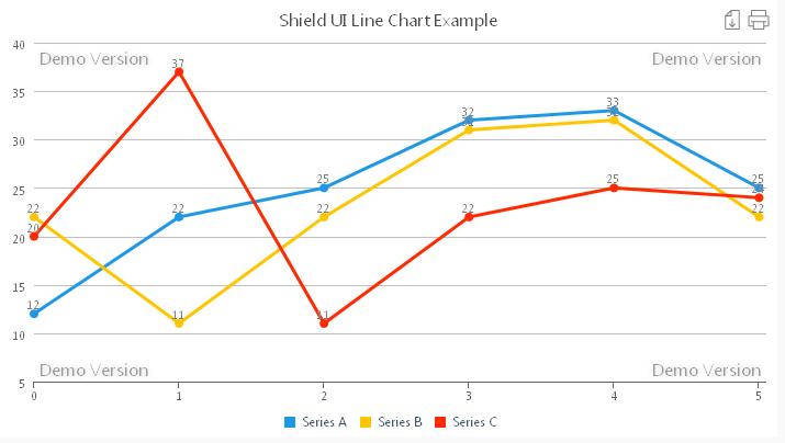
The chart offers many features – both visual and functional. For instance additional informational labels can be placed along each point for faster and accurate data reading by the users. For this purpose we use the seriesSettings property as shown:
seriesSettings: {
 line: {
         dataPointText: {
                 enabled: true
  }
 }
},
Amongst the functional features of the chart are worth noticing are the possibilities of binding it to Local, Remote or Live Data. And this combined with the easy referencing and rendering of the chart using a <DIV></DIV>container .
Data supplied data for each series is in the format:
dataSeries: [{
seriesType: 'area',
collectionAlias: "Name of Alias",
data: [1,2,3,4,5]
},
But we may also declare two-dimensional arrays for passing both the data series and categorical values as shown in the code below:
            var VariableA = [
                {x:'2001',y:0.164},
                {x:'2002',y:0.173},
                {x:'2003',y:0.184},
                {x:'2004',y:0.167},
                {x:'2005',y:0.177},
                {x:'2006',y:0.189},
                {x:'2007',y:0.180},
                {x:'2008',y:0.183},
                {x:'2009',y:0.188},
                {x:'2010',y:0.160},
                {x:'2011',y:0.176},
                {x:'2012',y:0.178}
            ];
            var VariableB = [
                {x:'2001',y:0.103},
                {x:'2002',y:0.105},
                {x:'2003',y:0.112},
                {x:'2004',y:0.111},
                {x:'2005',y:0.102},
                {x:'2006',y:0.099},
                {x:'2007',y:0.110},
                {x:'2008',y:0.113},
                {x:'2009',y:0.117},
                {x:'2010',y:0.119},
                {x:'2011',y:0.123},
                {x:'2012',y:0.117}
            ];
                dataSeries: [{
                    seriesType: 'line',
                    collectionAlias: "Series A",
                    data: VariableA
                }, {
                    seriesType: 'line',
                    collectionAlias: "Series B",
                    data: VariableA
                }]
As seen in the above snippet we have no extra code at all in order to bind to predefined data:. We only assign it to the chart’s series:
data: VariableAWhen set to percent the stackMode property will represent data as rectangular area divided by each data series values as shown on the next image: A live editable example for the Shield UI Line Chart can be found here: Live Example
Няма коментари:
Публикуване на коментар