The Shield UI Bar Chart is another classical HTML5 JavaScript chart type offered to users as part of their extended charting library.
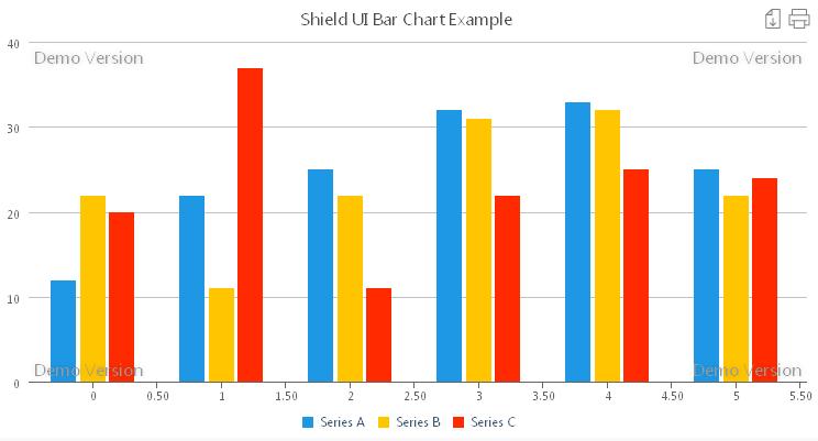
It is intended mainly to show or compare data change between categories using equally sized bars. Below you may find an illustration of the chart’s typical look:
dataSeries: [{
seriesType: "bar",
collectionAlias: "Total Visits",
data: [12, 11, 23]
}, {
seriesType: "bar",
collectionAlias: "Unique Visits",
data: [12, 11, 23]
}]
Although being a popular type of chart, the Shield UI Bar Chart offers many useful features. For instance we may emphasize a bar of a data series by preselecting it. We may do so right in the code:
data: [12, { y: 11, selected: true }, 23]
We may allow the users to select a bar or prevent them from doing so by using the enablePointSelection property:
seriesSettings: {
    bar: {
        enablePointSelection: true
    }
}
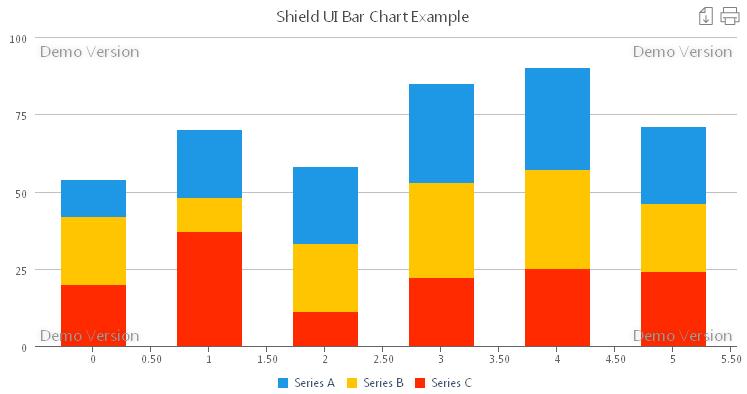
For more advanced data sets or more advanced comparisons the Shield UI Bar Chart offers users the ability to group data series by stacking them in one bar and showing the cumulative values on the chart. There are two options users can choose from: The one, shown on the image below:
seriesSettings: {
bar: {
stackMode: "normal"
}
},
We can also use percent stacking, in which case all the bars will be of equal height as shown on the next image:

To enable percent stacking we use the following code:
seriesSettings: {
bar: {
stackMode: "percent"
}
},
The difference between the two stacking modes is that when using normal stacking, each bar represents a cumulative value of the sums of all the data series for each point. When using percent stacking the values for each point are represented as percentiles of the cumulative value.
The Shield UI Bar Chart offers users effortless binding to remote or local data along with features like zooming, exporting or printing of the chart. This reliable HTML5 JavaScript Chart supports multiple axes and negative values representation.
We may use an additional Y axis when the data displayed on the chart may have dual meanings. For instance one value for weight may be shown in kilograms and pounds both supplying user with more information and keeping the chart area easy to read.
A live editable example for the Shield UI Bar Chart can be found here: Live Example
Additional resources and code samples can be found here: Documentation
Няма коментари:
Публикуване на коментар