
As we can see, the line retains it’s Y value until it reaches the next point and then goes up or down to it. One of the typical usages of the Step Line chart might be to show static or dynamic forex data sets.
We may wish to aid users in easier reading the chart’s data by taking use of the axisMarkers property which dynamically places horizontal or vertical lines to the position of the current data point. To do so we may use similar to the following code:
    tooltipSettings: {
      axisMarkers: {
        enabled: true,
        mode: 'x',
        width: 1,
        zIndex: 3
      }
    },
On the next image we can see the axisMarker line:

We may also alternatively emphasize the marker line by increasing its width or coloring it:
    tooltipSettings: {
      axisMarkers: {
        enabled: true,
        mode: 'x',
        width: 3,
        zIndex: 3,
        color: green
      }
    },
And here is the result:
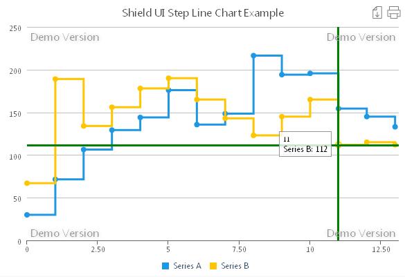
Unlike other Shield UI’s chart types the step line chart takes single values to display. We can conveniently connect the chart to a local or remote data source. In our online demo we are implementing local data binding. The data values are being assigned to two variables as shown below:
  var LocalData = [29.9, 71.5, 106.4, 129.2, 144.0, 176.0, 135.6, 148.5, 216.4, 194.1, 195.6, 154.4, 145, 133];
  var LocalDataB = [67, 189, 134, 156, 178, 190, 165, 143, 123, 145, 165, 112, 115, 112];
Than we only need to bind the appropriate variables to their data series as shown:
    dataSeries: [{
      seriesType: "stepline",
      collectionAlias: "Series A",
      data: LocalData
    },{
      seriesType: "stepline",
      collectionAlias: "Series B",
      data: LocalDataB
    }
]
As we can see adding multiple series is just as easy as with any Shield UI’s chart. However we need to avoid adding too much data to the chart, since this will only make it look messy and confuse users.You can look and try the online live example for the Shield UI Step Line Chart here: Live Example
In addition you may look at the online documentation, tutorials and code samples for the Step Line Chart here: Documentation and examples
Няма коментари:
Публикуване на коментар