четвъртък, 5 декември 2013 г.

JavaScript Spline Chart

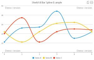
The Spline Chart offered by Shield UI as part of their HTML5 Charting Library may be referred to as an enhanced version of the classical line chart. In this chart the lines connecting the data series points are smoothly curved as shown on the next image:
 SpLine_1 

Besides the enhanced look this chart offers all the feature and functionalities of the library. Being often convenient for Spline charts containing more than one data series, we may display the values of each point by enabling the dataPointText property. The following code shows how we can do that:
seriesSettings: {
 spline: {                       
         dataPointText: {
                 enabled: true
  }
 }
},
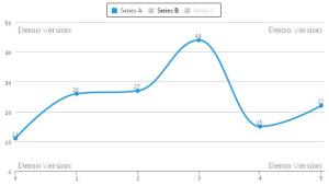
If we add all data series to the legend, we than may show or hide certain ones, so that we can easily make comparisons or analyses.

 SpLine_2 

As we can see from the above image only one data series remains visible, so that we can easily focus on its values. Combined with the labels visible for each point users have a great deal of information available in front of them. As much as style is concerned we can not only have a chart legend- a list of the available data series, but we can also format it just the way we need. We can place it top or bottom, left or right, can adjust corners smoothness and so on as shown in the next code fragment:
                chartLegend: {
                    align: "center",
                    verticalAlign: "top",
                    borderRadius: 2,
                    borderWidth: 2
                },
Being part of Shield UI HTML5 Charting Library the Spline chart supports the same easy and reliable way of data binding. We may either directly supply the data series values as shown below:

dataSeries: [{
seriesType: 'Spline',
collectionAlias: "Name of Alias",
data: [1,2,3,4,5]
},
 
Or we may use a variable:

dataSeries: [{
seriesType: 'Spline',
collectionAlias: "Name of Alias",
data: VariableA 
},
Shield UI Spline chart also supports binding to remote data, smooth and reliable zooming and panning, as well as exporting and printing features. For even more convenience the chart legend has built in interactivity- clicking on a data series label automatically hides/shows it without the user having to write a single line of code.

A live editable example for the Inversed Shield UI Bar Chart can be found here: Live Example

Additional resources and code samples for the Inversed Bar Chart can be found here: Documentation and examples
Няма коментари:

Публикуване на коментар